
Artificial intelligence and machine learning will impact clinical medicine more than we imagine. Clinicians should understand the results of AI models and take part in creating them. AI and software developers must convince clinicians and other healthcare stakeholders that their models are of value. The clinical setting is vital to understanding the actual performance of AI. This post discusses ways to understand performance measures in clinical artificial intelligence.
We review the confusion table, some standard medical diagnostic statistics, and how they relate to other ML and AI model performance measures. After reviewing tasks such as classification, image analysis, and regression problems, we suggest how to present AI model performance to clinicians.
Key concepts covered
- The confusion table for diagnostic testing and what we can use it for.
- Some measurements to interpret AI and ML performance and how to interpret these measures.
- How these relate to traditional clinical and medical research statistics.
- What to think about when we report AI and ML model performance of models.
Considerations in presenting AI model performance to clinicians.
All methods that measure performance come with their strengths and weaknesses. But we often want to look at a problem from different angles. This post builds on the Clinical AI Research (CAIR) checklist review, which aims to elaborate on the basics of AI research for orthopedic surgeons.1
Positive and negative
We discuss “positive” and “negative” in medical diagnostic testing. When we do, we mean whether a test indicates the presence (positive) or the absence (negative) of what we seek. They are not values or benefits, meaning good or bad. This is something patients sometimes get confused about.
We will also discuss true positives, false positives, false negatives, and true negatives. We call these “truth values” and they are about a test set. A test set is data where we know and have decided beforehand if the test should show positive (present) or negative (not present).
Datasets
Datasets are collections of data we want to model. The training set is the data used to train models.
A validation set is a part of the training dataset used to test the model during training. After each run-through of the training data, the model is assessed against the validation set. We stop the training once we reach the desired performance against the validation data. Then, we test the trained model against the test set. The result from this final step is what we report as model performance.
We saw that the test set is data where we know what result the model should give for each case. It is also called the “ground truth.” However, the ground truth can’t have been decided by the same method we are testing.
For example, in machine learning image classification, human reviewers usually manually determine if the image has a cat in it or not. If the model says no cat, but a cat is in the picture, it is a false negative. For a Covid-19 rapid test kit, the accuracy is compared to polymerase chain reaction (PCR) amplification of the virus parts.2,3 We also say that PCR is the “gold standard” as it is the best and most reliable test for Covid-19.
To make it more confusing, external validation is another form of testing. In external validation, you take test data from an independent location and apply your model. This tests how general the model is or if it just works at the location it was trained on.
There must be no overlap between the different datasets. For example, if you have patients, any patient can only be found in one of these sets. And you cannot move patients between the datasets.
Balanced and imbalanced data
Another vital thing to consider is how the test data is divided. If you have two possible results, and both are equally likely, you have 50/50 positive and negative cases. This is a balanced dataset. If you have 40/60 or 60/40, the data is still relatively balanced. But it is no longer as balanced if you have a 30/70 chance. We say that the data is imbalanced. There are many situations where this could happen for any test, but this will occur by necessity if you have more than two outcomes. For example, the most “even” distribution with three outcomes is one-third of each.
Say you have a set of images of cats, dogs, and cars that are evenly distributed. (If you want to make it a medical example, you make it the skin cancers melanoma, squamous cell carcinoma, or basal cell carcinoma.) You have a test (e.g., AI model) that determines what is in the picture. How you usually would go about it is to make three separate tests and select the one that gives the highest likelihood. I.e., you would have separate tests that determine for each outcome, i.e., car or not, a cat or not, or an chimp or not. This will have implications for diagnostic performance.
Confusion matrix
Many of the performance measures we will discuss are known to clinicians from diagnostic testing. We often encounter specificity, sensitivity, and accuracy, but ML has many other performance measures. We need to strike a balance between measurements that clinicians are familiar with and achieving methodological perfection. If you are talking to a patient and explaining what a test shows, that is even truer.
A binary test has two possible outcomes. Sometimes, it is true or false, sometimes positive or negative, or outcome A or B. When assessing the outcome of an experiment or a diagnostic test, we typically present it as a confusion table. The true value (ground truth) is on one axis, and the prediction is on the other. The result is four possible “truth values” for a binary diagnostic test, as in the table.
| Prediction | |||
| Positive (detected) | Negative (not detected) | ||
| Ground truth | Positive (disease) | True positive (TP) | False negative (FN) |
| Negative (normal) | False positive (FP) | True negative (TN) | |
Suppose we are using a model to classify AI generated images. We present the resulting 3-by-3 contingency table (a confusion matrix bigger than 2×2) in Figure 1.
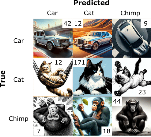
The usual way to deal with this 3-by-3 data is to divide it into parts, where we look at each outcome separately, as in Table 3.
| Predicted Car | Predicted Cat | Predicted Chimp | ||||||||
| True | False | True | False | True | False | |||||
| True | TP (42) | FN (21) | True | TP (171) | FN (35) | True | TP (44) | FN (14) | ||
| False | FP (19) | TN (256) | False | FP (30) | TN (102) | False | FP (25) | TN (255) | ||
Confusion matrices (or confusion tables) are closely related to hypothesis testing and are widely used in medicine and computer science.
Decision threshold
We need to decide: when is an outcome positive or negative? For example, we might decide that the test is positive if there is a >50% predicted chance of fracture. However, we could also choose we needed >90% certainty to determine that there is a fracture. We would get fewer positive test results, fewer false positives, and different confusion matrices. The number of negatives could change to more false negatives, as something with an 89% chance of being a fracture would now give a negative test result. A screening test might consider a >20% likelihood of positive, resulting in many false positives but very few false negatives. The decision threshold is the probability at which we decide whether a test is negative or positive. It is also called the cut-off.
The resulting confusion tables would look different in the three examples. To make a confusion table, we first decide on a decision threshold, and the truth values follow.
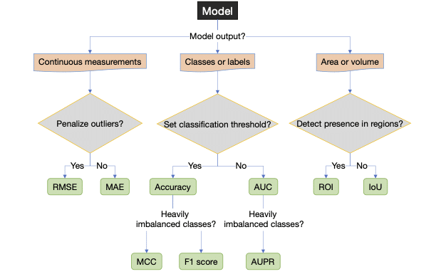
Measuring performance in artificial intelligence and machine learning
Let’s list the performance measures we will be mentioning, though there are many more. Most are threshold-dependent, and some are threshold-independent.
| Name | Description |
|---|---|
| Threshold-dependent performance measures | |
| Accuracy | (TP+TN)/(TP+TN+FN+FP) |
| Sensitivity, true positive rate (TPR), Recall | TP/(TP+FN) |
| Specificity | TN/(TN+FP) |
| Youden J | Sensitivity + Specificity – 1 |
| False positive rate (FPR) | FP/(TN+FP) = 1–Specificity |
| Precision, Positive predictive value (PPV) | TP/(TP+FP) |
| Negative predictive value (NPV) | TN/(TN+FN) |
| F1-score, Dice score | 2*Precision*Sensitivity/(Precision + Sensitivity) = 2*TP/(2*TP+FP+FN) |
| Matthews’ correlation coefficient (MCC) | (TP*TN -FP*FN)/√((TP+FP)(TP+FN)(TN+FP)(TN+FN)) |
| Performance curves (threshold independent) | |
| Receiver operating characteristic (ROC) curve | Sensitivity (y-axis) against 1-Specificity (x-axis), i.e. TPR against FPR |
| Precision-recall (PR) curve | Precision (y-axis) against Sensitivity (x-axis) |
| Area under the “performance” curve (threshold independent) | |
| AUC of the ROC curve (AUC) | Statistic of model performance |
| AUC of the PR curve (AUPR) | Statistic of model performance |
| Object detection and localization – Image segmentation (localization in an image) | |
| Intersection over Union (IoU) | TP/(TP+FP+FN) |
| Region of Interest (ROI) | Used in 2D and 3D image segmentation |
| Regression modeling (continuous data) | |
| Means squared error (MSE) | Σ(prediction-true)2/Number of cases |
| Root mean squared error (MSE) | √MSE |
| Mean absolute error (MAE) | Σ|prediction-true|/Number of cases |
| Summary of multiple-outcome performance measures | |
| Average | Mean of all performance measures. |
| Weighted average (WA) | Weighed mean of various performance measures |
| Frequency weighted average (FWA) | Weighted mean according to frequency in the test set. |
Accuracy
Accuracy is the proportion (or percentage %) of correct answers.
Accuracy = (TP+TN)/(TP+TN+FN+FP)
If you have 50/50 positives and negatives, flipping a coin will get you almost 50% accuracy. If you have 30/70 positives and negatives, you should get 30% accuracy guessing randomly or flipping the coin. But if you design your test always to guess negative, your accuracy would be 70%! That is a performance increase of 133%. This is one of the reasons why it is usually recommended to have 50/50 positives and negatives in the test data with two outcomes.
What if you have more than two outcomes? In our example with an even set of cats, dogs, and elephants above, if we always guess “not” (not cat, not dog, or not elephant), we would be 66% accurate. If we add chimpanzees to the mix, we can get 75% accuracy by constantly saying “not.” This could be a realistic scenario in a machine learning scenario where the goal of the training is to maximize accuracy. For that reason, accuracy has limited value for imbalanced data.
Sensitivity (recall, true positive rate) and specificity (selectivity and true negative rate)
Sensitivity and specificity are properties widely used in medicine and well-known to clinicians.
Sensitivity measures how likely a test is to exclude or detect a condition correctly. Sensitivity is the proportion of rightly discovered positive cases (or true positives) compared to actual cases (false negatives are cases where the condition should have been detected but was not). Yet another way to say this is: “If you have what the test is looking for, what is the likelihood of the test detecting it?”
Sensitivity = TP/(TP+FN)
Sensitivity is also known as recall, which is more common in computer science, the true positive rate (TPR) and the hit rate. We can achieve 100% sensitivity by saying everyone has the condition since we will never have any false negatives.
Specificity represents the true negative (TN) rate. We compare the proportion of correct negative cases to all negative cases. After all, false positives are negative cases where they are flagged as positive. “If you do not have what the test is looking for, what is the probability that you will get a negative result?”
Specificity = TN/(TN+FP)
Specificity is also known as selectivity or true negative rate (TNR).
We can get 100% specificity, by always testing negative. But it would negatively impact sensitivity. Good tests balance out these two.
Specificity and sensitivity ratio a proportion of true positives and negatives, not a condition’s probability.
Youden J combines specificity and sensitivity into one metric and is a way to summarize them into a single value. Youden J ranges from 0 to 1, and 1 means a better discriminator than 0.
Youden J = Sensitivity + Specificity – 1
False positive rate (FPR)
The FPR is the proportion of negative outcomes incorrectly predicted as positive and is the opposite of sensitivity.
False positive rate = FP/(TN+FP) = 1–Specificity
Positive predictive value (PPV) and negative predictive value (NPV)
Given a prediction, we want to know how likely it is to be correct. PPV (also known as precision) answers the question: if we have a set of cases predicted as positive, what proportion of those outcomes were genuinely positive (i.e., true positives)? NPV measures the same for negative instances, i.e., if we have a set of negative test results, what proportion of those outcomes are genuinely negative (true negative)?
Positive predictive value = TP/(TP+FP)
Negative predictive value = TN/(TN+FN)
PPV and NPV, in contrast to specificity and sensitivity, give the probability of an outcome based on the prevalence in the sample.
Precision and recall
Precision and recall, as terms, are commonly used in ML and AI circles but rarely in medicine. Precision is the PPV, while recall is the sensitivity. Both the precision and sensitivity ignor true negatives. As such, they are less affected by class imbalances in data. Figure 2 illustrates their relationship. We mention them specifically, as they will become central in our discussion of performance measures.

F-scores, and F1 score (or the Dice Score) in particular
Class imbalance is a recognized problem in medical AI, and it has become more common to use performance measures that consider it. Precision and recall are less susceptible to class imbalance because the true negatives are ignored. The F-score is a way to combine precision and recall.
The general F-score, F\beta, is defined as
F\beta = \frac{Precision \cdot Sensitivity}{\beta^2 \cdot Precision \cdot Sensitivity},
and attaches \beta times more meaning to precision than sensitivity.
The usual F-score is the F1 score (with \beta as 1), also known as the Dice score. F1 is the harmonic mean of precision and sensitivity and considers FN and FP errors equally costly.
F1 = \frac{2TP}{2TP+FP+FN}
The F1 score is well suited for imbalanced classification problems. It is also used in image segmentation and localization tasks. The F1 score can also be understood as data overlap.

Depending on the application and what we are interested in, we can modify this score to penalize different errors, i.e., precision vs. sensitivity or FN vs. FP. Any \beta is possible, but two frequent options, apart from \beta=1 are F2 and F0.5. The F2 score emphasizes precision, while the F0.5 stresses recall.
Matthew’s Correlation Coefficient (MCC)
As we described, class-imbalanced problems are ever-present in medicine. The resulting imbalanced data can be challenging for performance measures to capture fairly.
MCC considers the confusion table and computes the correlation between the observed outputs and the classifier’s predictions. It is a discrete version of the Pearson correlation coefficient for two outcomes. MCC balances the entire confusion matrix, and because of that, it is suited to imbalanced problems. Many consider MCC the best performance measure for binary classification4–7, but it and its properties are not easy to understand8,9. Outside of bioinformatics, few use MCC in medicine.
MCC = \frac{TP \cdot TN - FP \cdot FN}{\sqrt{(TP+FP) \cdot (TP+FN) \cdot (TN+FP)\cdot (TN+FN)}}
MCC can say that the model performance is good or bad, but it doesn’t say why it is good or bad. You still need to do a deeper analysis of all the included components to find the problem.
Other suitable performance measures exist but are rarer.
Performance curves and area under the curve (AUC)
ased on classification results, we derived the previous performance measures from the confusion table. AI classification systems usually yield a probability score as output (e.g., 99% could result in a positive while 3% in a negative) and classify data according to a decision cut-off. These cut-offs can be arbitrary (e.g., 50%). Sometimes, they are tuned on a separate development dataset or derived from literature. We constructed the confusion table based on whether we detected a condition or not, depending on if it was present. The outcome of that decision-making process depends on the classification threshold.
We can compute the negative rate for all thresholds (i.e., from 0 to 1) and plot them in a curve to assess the forecasts without relying on a single classification threshold. Computing the confusion matrix and outputs for all possible thresholds is not realistic. Instead, we calculate the confusion matrix for some thresholds, combine them into a curve, and estimate all points in between by interpolation.
We can estimate generic model performance by computing the area under the curve. We generally use these measures are to compare models. Two curves commonly studied are the receiver-operating characteristic (ROC) and precision-recall (PR) curves.
The receiver operating characteristic (ROC)
The ROC curve plots the sensitivity (the y-axis) against the FPR (the x-axis) for all decision thresholds to obtain a curve. The ROC curve measures the model’s ability to separate the groups by penalizing them based on how wrong probabilities are.
Area under the ROC curve (AUC)
When research literature mentions AUC, it usually refers to the area under the ROC curve (AUC). Unless explicitly stated, we will use AUC for the area under the ROC curve. AUC is often used to measure a model’s overall accuracy.
Interpretation of the AUC
As AUC depends on the specificity, which depends on the TN, it is sensitive to imbalanced data. High AUC risks overestimating performance for a clinical trial or practical application because it is related to overall accuracy. One should consider a different performance measure for imbalanced data sets. However, we usually encounter AUC during research and development, where it is used to measure the overall model performance. It does not confine the model to a specific decision threshold, as it is computed over all thresholds. The AUC is well-understood (strengths and weaknesses), easy to interpret, and has convenient properties.
Precision-Recall (PR) curve
Precision is the same as PPV, and recall is the same as sensitivity. The PR curve illustrates the tradeoff between precision and sensitivity and measures the model’s ability to separate between the tested groups. As neither precision nor sensitivity depends on TN, they are considered well-suited to class imbalance data.
The area under the precision-recall curve (AUPR)
Like AUC, we can compute the area under the precision-recall curve (AUPR) to assess a model’s performance. Like AUC, AUPR measures the model’s performance in a way that is not affected by the classification threshold.10
Interpretation of AUPR
Although a valid alternative to AUC, methodological issues exist with AUPR as a performance measure. There is no clear, intuitive interpretation of AUPR or its properties and no consensus on what a good AUPR is.
One way I deal with AUPR is to look at the expected AUPR value for a model that guesses at random. For the AUPR, a random model will perform proportionally to the number of positive outcomes for that class.
AUPRrandom = number of cases for the class/total number of cases.
If a dataset consists of 10% of Y, a random classifier should deliver an AUPR of 0.1, and anything above that is better than chance.10 We can understand if the performance is better than chance by computing a confidence interval (CI) along with the AUPR. Therefore, it is good to report whether the AUPR outperforms a random classifier – i.e., when the lower 95% CI bound is better than the random classification.
AUPR, and similar performance measures, is an active research field. But, most of these performance measures still need more research and need to be better established.
Image segmentation or localization in artificial intelligence
Sometimes, the research problem is to detect and locate a pathological lesion (injury or disease sign) in an image and to train the model to mark out the areas of interest as a human would. It is considered a success if the overlap between the model and human reviewers is sufficient. The measures to evaluate segmentation and localization tasks presented next are equally valid for 2D and 3D data sets.
The F1 score is a commonly used performance measure based on its alternate interpretation as overlapping sets; however, the Intersection over the Union (IoU) is more intuitive.
Intersection over Union (IoU) or Jaccard index
In percentages, IoU measures the pixel overlap of the combined area formed by the predicted and actual location (ground truth). Depending on the application and source, it is typical to consider >50% of pixels to be a enough overlap for success. The IoU is also known as the Jaccard index.
IoU = \frac{TP}{TP+FP+FN}

The relationship between IoU and F1 score
F1 is more optimistic than IoU, i.e., and IoU is never greater than F1 (IoU ≤ F1). IoU can also be written as
IoU = \frac{|ground truth true ∩ predicted true|}{|ground truth true|+|predicted true|-|ground truth true ∩ predicted true|}
and the F1 score as
F1 = \frac{2|ground truth true ∩ predicted true|}{|ground truth true|+|predicted true|}
We can convert between IoU to F1, and back, via the relationships
F1 = \frac{2 \cdot IoU}{1 + IoU} and IoU = \frac{F1}{2 - F1}.

Measuring presence or absence in images
Localization tasks can consist of determining the presence or absence of pathology and can be a type of classification. The same measures used for other classification tasks, e.g., ROC analysis, can be used.10 However, if we want to locate a specific region (e.g., a lesion), the ROC or PR curve cannot measure the model’s ability to discover that region.
Region of interest (ROI) analysis
One option is region of interest (ROI) analysis. The image is first divided into regions. For example, parts of a brain scan could be divided into their respective cortexes. For each area, a rater assigns a lesion probability in that region. Plotting the ROC curve with the number of regions falsely assigned to have a lesion, the performance can then be studied using ordinary ROC analysis. The patient or image is the unit to be observed in regular ROC analysis. In contrast, each region is of interest in ROI.11,12
Free-response operating characteristic (FROC) analysis
The Free-Response Operating Characteristic (FROC) curve is an alternative measure to incorporate the localization aspect. In FROC analysis, the rater is tasked with listing all abnormal areas with a suspected lesion and estimating the probability of a lesion. The proportion of correctly located (within some distance) and classified abnormalities are plotted on the y-axis. The x-axis is the average number of false positives per patient.11 An alternative FROC (AFROC) approach is to use the probability of at least one false positive finding on the x-axis. AFROC allows for computing the AUC as a summary measure of model accuracy.10–15
Compared to ROI, which gives the probability of a lesion in a region, FROC can estimate the number of lesions in an area and the individual probabilities for each lesion.
Continuous measurements
Continuous measurements could include estimating the distance between two points or the angle between the upper and lower leg when bending the knee joint. As these are continuous values, usually measured in millimeters, an AI model measuring these distances would use regression models to estimate the distance.
Mean squared error (MSE) and the root mean squared error (RMSE)
Mean squared error (MSE) is a typical performance metric for continuous data. It computes the average squared error between the predicted and actual values.
MSE = \frac{\sum_{i=1}^n(true_i - prediction_i)^2}{n}
Squaring the error penalizes large errors, i.e., gives them more importance, and MSE is more sensitive to outliers. You also get units that can be confusing to interpret. For example, if you measure angles, the resulting error will be in square degrees.
Usually, the square root is taken from the MSE, giving the RMSE, which benefits from having the same unit and is easily relatable to the original value.
RMSE = √MSE
Mean absolute error (MAE)
The mean absolute error (MAE) finds the average distance between the predicted and actual value. MAE is less affected by outliers than MSE and RMSE, as it does not square the value difference.
MSE = \frac{\sum_{i=1}^n|(prediction_i - true_i)|}{n}
Multiple measurements
Getting an AI model to detect the presence or absence of pathology (two outcomes) with high accuracy is generally easy if you have sufficient cases. Another situation arises when we want an AI model to classify, locate, or detect many outcomes. While we need to report the result for every outcome, it can also be interesting to report a summary statistic to compare different models. As we do with a group of individuals where we present a population mean, we might want to merge numerous measurements into meaningful summary statistics.
Average
The mean (or average) is the simplest way to report a combined performance measure for all groups and is suitable if the groups are similar in size.
Average = \frac{\sum_{coutcome=1}^{last}measure_{outcome}}{n_{outcomes}}
Where n is the number of outcomes.
Weighted average (WA)
Rather than size, we could view different outcomes as having different importance. Perhaps we want more serious diseases to carry more weight. We could assign an individual weight to each outcome (woutcome) depending on how important we feel the outcome is
WA = \frac{\sum_{outcome=1}^{last}w_{outcome} \cdot measure_{outcome}}{\sum_{outcome=1}^{last}w_{outcome}}
Frequency weighted average (FWA)
Taking averages of all outcomes will give excessive importance to small groups. Assigning individual weights to every outcome might sometimes be complicated and arbitrary. But, if one group is, e.g., twice as prevalent as another, it makes sense that it should contribute more to the overall accuracy. Weighting according to frequency (FWA)
FWA = \frac{\sum_{case=1}^{last}n_{case} \cdot measure_{case}}{\sum_{case=1}^{last}n_{case}}
where n is the number of cases in each class.
It can be a good idea to exclude the negative outcome if it is a big part of the test data. For example, some argue that you should always have 50% “no pathology” cases in your datasets. Your FWA will be 50% “no pathology” detection if you do. If your model discriminates between forty outcomes, this might differ from what you are after. It could even give an over-optimistic view of the model’s performance.
Suggestions for presenting AI/ML research to clinicians
Based on our discussion and in line with the CAIR checklist, we have some ideas for reporting AI and ML study results to clinicians and non-machine learning experts.
How to report outcomes of artificial intelligence and machine learning models
The CAIR checklist advice for choosing outcome metrics suitable for clinicians. The CAIR checklist picked measures as they were (1) suitable and, in general, (2) interpretable to a clinician. The discussion regarding what makes a good choice is ongoing.
Classification
AUC is a standard measure that many clinicians have encountered or are familiar with. It is easy to understand as a model accuracy. But, we concluded that it is not good for imbalanced data. In those cases, we can accompany the AUPR with the AUC. If the performance in AUC is low, the additional information from AUPR is less relevant.
ROC and PR curves are informative, but if there are many outcomes, it is challenging to study every single PR curve. Summary AUC or AUPR can assist in understanding.
Continuous measurements
We can use root mean squared error (RMSE) or mean absolute error (MAE) for continuous variables like angles or coordinates. Both translate to values interpretable in the original scale and unit. Both are familiar to many clinicians from traditional statistics and regression data.
When outliers are a significant concern, RMSE is usually of more interest. For example, most patients will have low pain levels after wrist fracture surgery, measured on the visual analog scale (VAS). But more clinically relevant is identifying failures that risk high levels of VAS. (VAS is ordinal but is often treated as a continuous variable and then rounded.)
Machine learning allows for new applications, and, under some circumstances, we sometimes prefer the MAE. For example, if the system draws a bounding box around a fracture, the bounding box must be close to the fracture site most of the time. If the objective is to enhance efficiency while quickly viewing images, we are less concerned with rare and complex cases. These will, regardless of the bounding box, require more attention.
Area or volumes
The F1 score is a standard performance measure for segmentation performance in images. However, we saw that its interpretation is less intuitive than the IoU. F1 can also be over-optimistic, which can be another reason to go for IoU. As an alternative, particularly for 3D imaging, ROI is more intuitive than most alternate performance measures.
Accuracy
Accuracy is sometimes requested. Even its weakness, overestimating performance, is easy to understand. However, the F1 score is preferred if the data is imbalanced and can be visually illustrated. If you report the MCC, which many consider superior to the F1 score, be prepared to explain it because only some outside the bioinformatics or machine learning community will know what it means.
Conclusion
AI and ML will impact medicine in more ways than we can imagine. Clinicians must be involved in clinical AI. We have looked at some performance measures in clinical artificial intelligence.
Performance measures describe the result of the study or model. Using the right performance measure will give a correct context to the outcome. However, performance measure choice is not always clear and occasionally depends on an experiment’s stage and the audience. AUC and AUPR are appropriate for prospective studies or during the development of AI models. When we use an AI model as an intervention in a clinical trial or production setting, we must decide on a cut-off (usually the one that gives the best overall performance). Accuracy, MCC, or F1-score are more suitable. AUC could overestimate the model’s performance5, and since we have decided on a cut-off, a threshold-independent measure doesn’t make sense anymore.
Apart from performance measures, there is much more to medical research and presenting it.
Sources
Numbered sources.
1. Olczak J, Pavlopoulos J, Prijs J, Ijpma FFA, Doornberg JN, Lundström C, et al. Presenting artificial intelligence, deep learning, and machine learning studies to clinicians and healthcare stakeholders: an introductory reference with a guideline and a Clinical AI Research (CAIR) checklist proposal. Acta Orthop. 2021 May 14;1–13.
2. CDC. COVID-19 and Your Health [Internet]. Centers for Disease Control and Prevention. 2020 [cited 2023 Nov 9]. Available from: https://www.cdc.gov/coronavirus/2019-ncov/symptoms-testing/testing.html
3. Bustin SA, Nolan T. RT-qPCR Testing of SARS-CoV-2: A Primer. Int J Mol Sci. 2020 Apr 24;21(8):3004.
4. Olczak J, Emilson F, Razavian A, Antonsson T, Stark A, Gordon M. Ankle fracture classification using deep learning: automating detailed AO Foundation/Orthopedic Trauma Association (AO/OTA) 2018 malleolar fracture identification reaches a high degree of correct classification. Acta Orthopaedica. 2021 Jan 2;92(1):102–8.
5. Boughorbel S, Jarray F, El-Anbari M. Optimal classifier for imbalanced data using Matthews Correlation Coefficient metric. PLOS ONE. 2017 Jun 2;12(6):e0177678.
6. Chicco D, Jurman G. The advantages of the Matthews correlation coefficient (MCC) over F1 score and accuracy in binary classification evaluation. BMC Genomics. 2020 Jan 2;21(1):6.
7. Chicco D, Jurman G. The Matthews correlation coefficient (MCC) should replace the ROC AUC as the standard metric for assessing binary classification. BioData Min. 2023 Feb 17;16:4.
8. Chicco D, Warrens MJ, Jurman G. The Matthews Correlation Coefficient (MCC) is More Informative Than Cohen’s Kappa and Brier Score in Binary Classification Assessment. IEEE Access. 2021;9:78368–81.
9. Zhu Q. On the performance of Matthews correlation coefficient (MCC) for imbalanced dataset. Pattern Recognition Letters. 2020 Aug 1;136:71–80.
10. Saito T, Rehmsmeier M. The Precision-Recall Plot Is More Informative than the ROC Plot When Evaluating Binary Classifiers on Imbalanced Datasets. PLoS One [Internet]. 2015 Mar 4 [cited 2020 Aug 6];10(3). Available from: https://www.ncbi.nlm.nih.gov/pmc/articles/PMC4349800/
11. Chakraborty DP. A Brief History of Free-Response Receiver Operating Characteristic Paradigm Data Analysis. Academic Radiology. 2013 Jul 1;20(7):915–9.
12. Obuchowski NA, Lieber ML, Powell KA. Data analysis for detection and localization of multiple abnormalities with application to mammography. Academic Radiology. 2000 Jul 1;7(7):516–25.
13. Bandos AI, Obuchowski NA. Evaluation of diagnostic accuracy in free-response detection-localization tasks using ROC tools: Statistical Methods in Medical Research [Internet]. 2018 Jun 19 [cited 2020 Dec 4]; Available from: http://journals.sagepub.com/doi/10.1177/0962280218776683?url_ver=Z39.88-2003&rfr_id=ori%3Arid%3Acrossref.org&rfr_dat=cr_pub++0pubmed
14. Chakraborty DP, Winter LH. Free-response methodology: alternate analysis and a new observer-performance experiment. Radiology. 1990 Mar;174(3 Pt 1):873–81.
15. Bandos AI, Rockette HE, Song T, Gur D. Area under the Free-Response ROC Curve (FROC) and a Related Summary Index. Biometrics. 2009 Mar;65(1):247–56.
16. Hillis SL, Chakraborty DP, Orton CG. ROC or FROC? It depends on the research question. Medical Physics. 2017;44(5):1603–6.